Rayshading Argentina in R
If you have spent any time on Mastodon and are intested in data visualisations, geography, RStats, or any of the intersections thereof, you are likely to have seen the stunningly beautiful 3D map visualisations that @terence has been creating with the rayshader package. I have been itching to get an excuse to play around more with this myself, and finally found a lovely one within the context of another little project.
We – that is Eugenia and I – are working on a small documentary photography project about the little villages/hamlets that are spread out over the Argentinean Pampa (that is the region, not just the province). We started toying with that idea back in April last year, and had the chance to make a lot of photos on a trip to Argentina in September.
What makes these towns really interesting are both their origins and today’s ongoing decline: The foundation of many of them goes back to the colonialisation of Argentina in the 1800s – when the growth of the Argentinean railway network enabled moving into more remote areas. Thanks to different government programs, plenty of boomtowns were created in quite regular intervals on the developing railroad network. But with the emergence of the road network alongside with transport via car/trucks - and the privatisation of rail network - the trains stopped coming for many of those villages, leading to an ongoing decline in population.
As part of our documentary project we are creating a little zine with a first sub-selection of some of the photos. We are also working on accompanying it by a small website (more info and links to all of that once we got the printed zines)! For this website we thought it would be nice to have some maps showing the region and where the towns are.
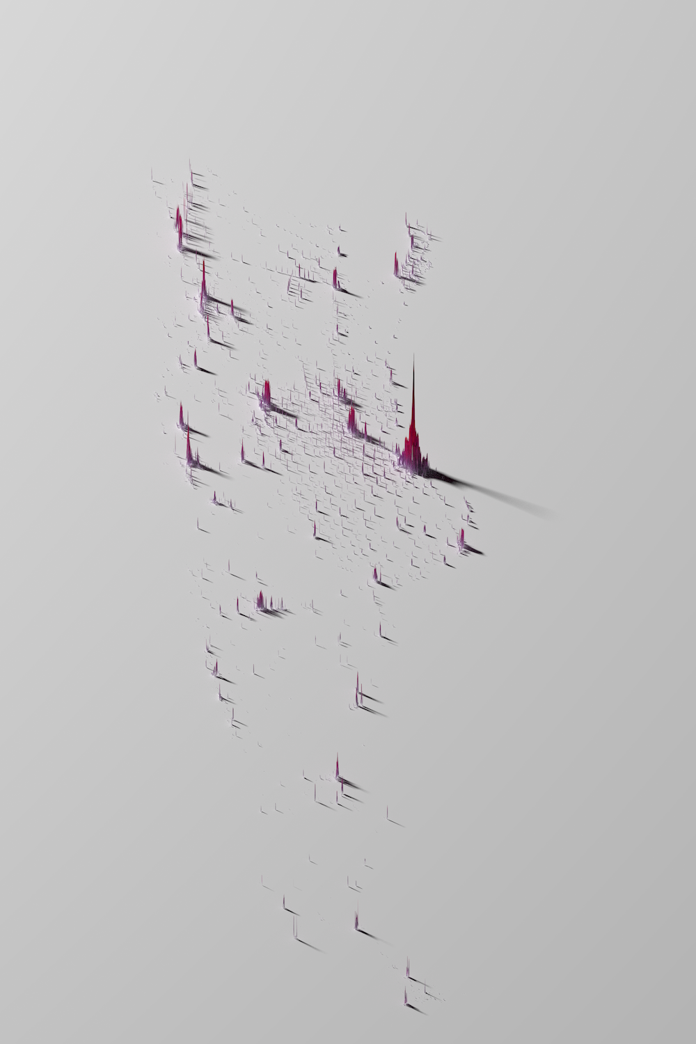
Which finally brings us back to the mapping excuse, as it seemed like those 3D raytracing maps of the population density could quite nicely show where those villages are and how they are distributed throughout the region. Looking at the map of the province of Santa Fe above, that seems indeed to work quite well! Based on population data from kontur, one can not see nicely where settlements are, but also a quite regular pattern that spreads more or less diagonally across the map!
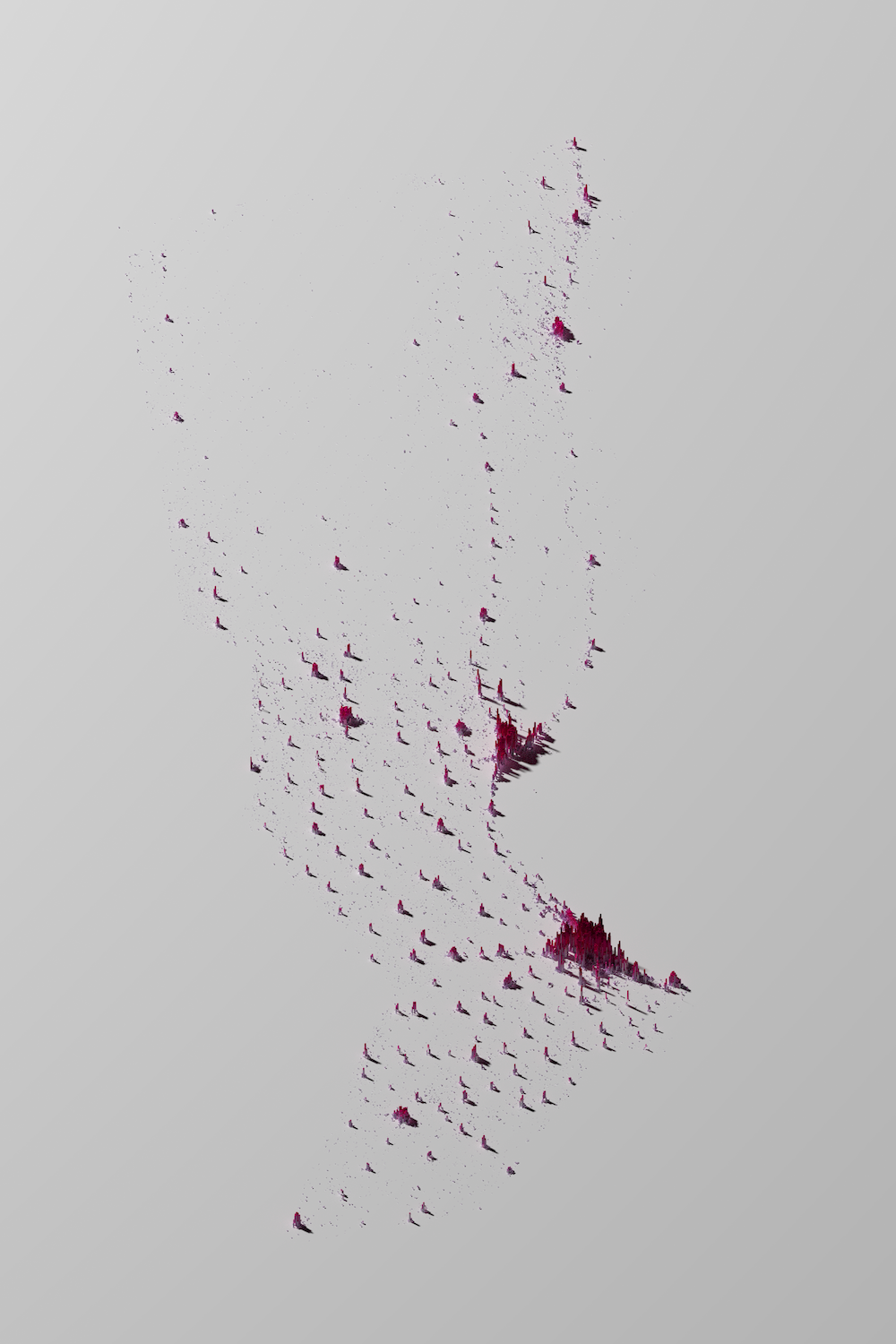
Zooming in a bit more, into the department of General López, we can see that pattern on a smaller scale, with one “band” of settlements moving from bottom-right towards top-left, and another one moving from bottom-left to top-right! Both of them follow nearly straight lines, mirroring the railway lines these places are located on.
I really enjoyed creating those little visualisations that will nicely go alongside the photos. Thanks to a lot of great tutorials and hints online, it wasn’t even too hard to create those from scratch: Erik Jensen has a great write-up on how to create population density maps with rayrender, which itself is an adaptation of a video tutorial by Spencer Schien that also has online code documentation.
If you want to reproduce these figures here, I put my code into a gist. If you want to adapt them for your own countries/regions of interest, data that can be used for this – including shapefiles for filtering to country or administrative borders as well as the population data – can be found on The Humanitarian Data Exchange.