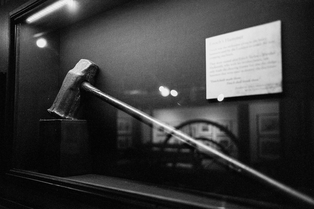
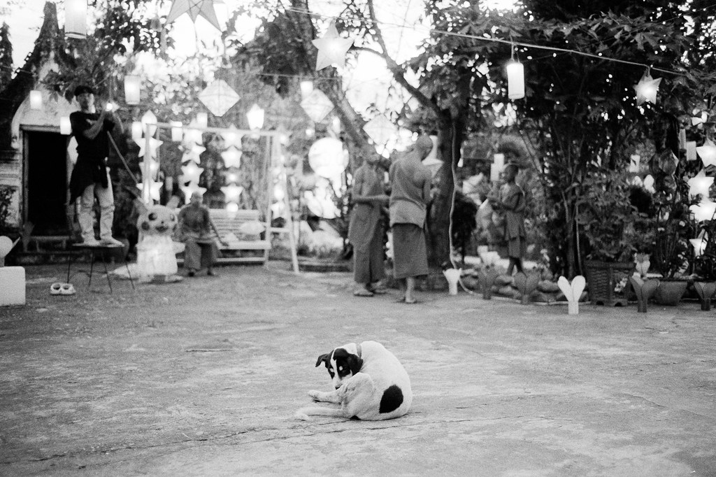
 Enoch’s Hammer of Luddite fame, at the Tolson Memorial Museum.
I gave a talk at the Pint of Science Festival – an international science festival that takes places at local pubs and cafes across the world – this evening. As part of this, The Alan Turing Institute organised a session called Imagined futures: Tales from tomorrow. The premise: A bunch of time-traveling researchers come back into the year 2024 to give a brief rundown of how the future looks like. Below is my contribution, hot of the press from the year 2074, with a whole bunch of links to the sources that inspired this vision.
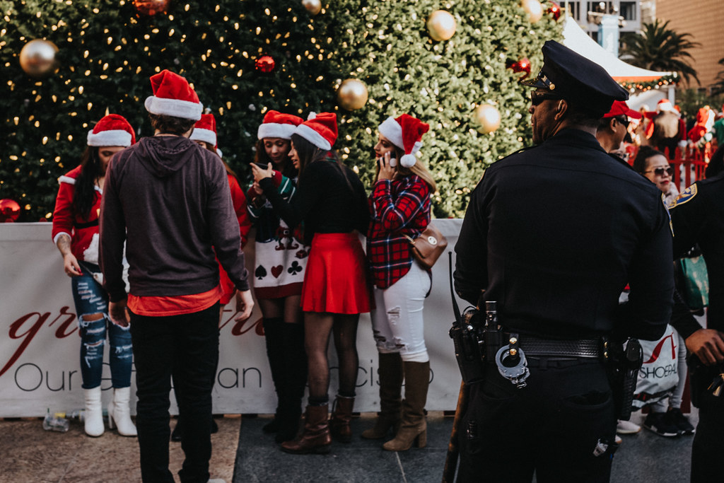
Wow! It’s really great to see so many of you turn out for this very very special day! Back in 2074, today is the 50th birthday of our good friend Jo, and if that’s not a great reason to celebrate! Don’t worry, we’ll get do the singing and the cake in about 10 minutes! But first, I wanted to be that guy, who uses this chance to look at how the world has changed throughout Jo’s lifetime. And oh dear, what a different world it was back then compared to now!
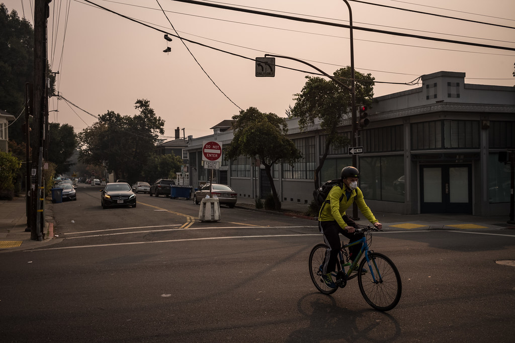
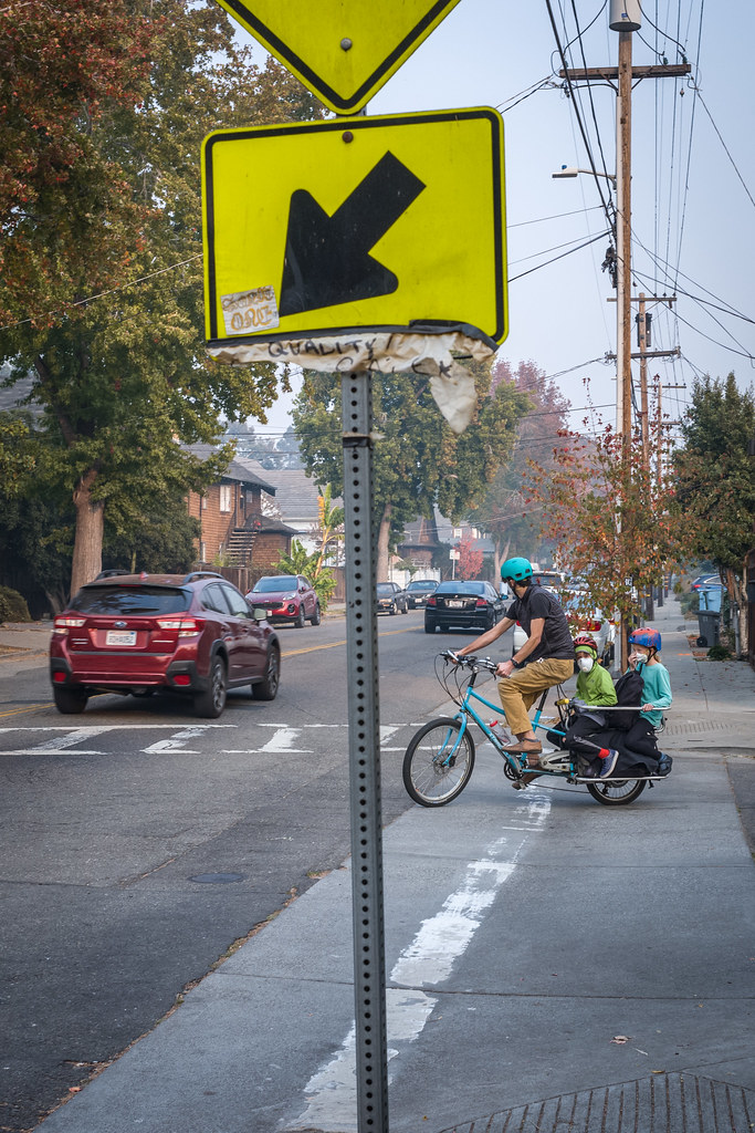
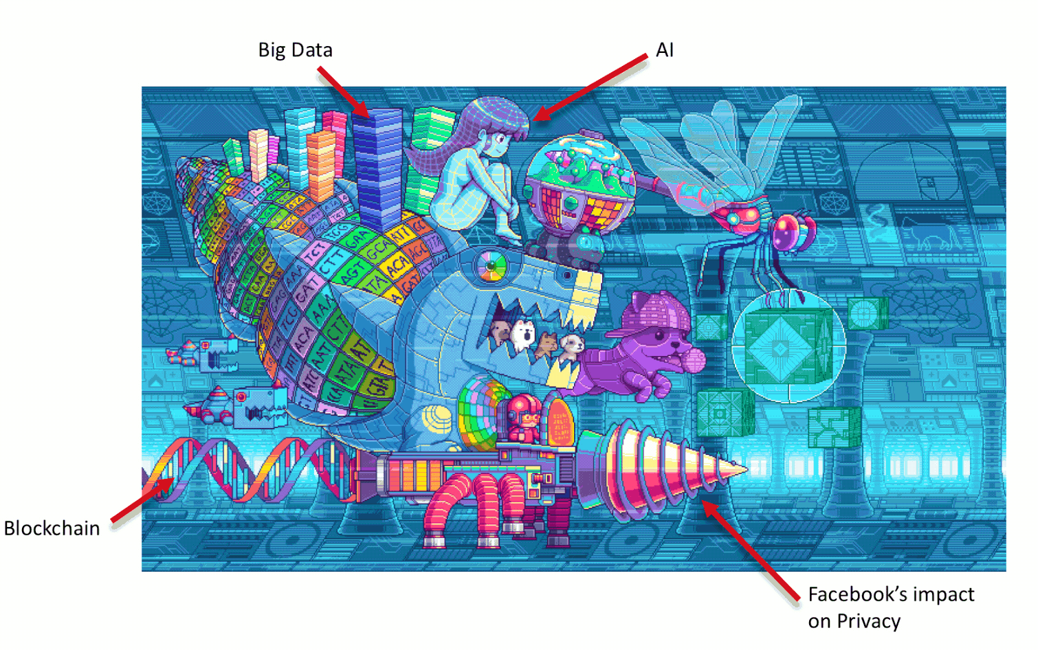
May 15, 2024. In 2074, we look back at this time as the top of the “AI” hype cycle: Generative “AI” was the gold rush topic of the day, and the UK government had just doubled down on their own efforts to get “AI” engrained into all spheres of life – and the public sector: From healthcare over education, crime “prevention” to immigration and access to public services. We saw a lot of these things being implemented rather quickly. You know the saying: If all you have is a hammer, everything looks like a nail. As a result, a lot of public services got “AI enhanced” – in the name of increasing productivity and saving money. And despite Brexit, many of these “AI” systems were directly copying the most “successful” ones used across countries in the EU.
These “AI systems” directly affected our friend Jo from early life onwards: Instead of investing in healthcare professionals, “AI” started to take over a lot of the NHS “frontline” work. So, in 2028, when Jo’s parents were worried about their child needing support for their invisible disabilities, direct access to doctors and human experts was no longer an option. Instead, chatbots had taken over the initial triage which – wrongly – did not provide any support or referrals to human experts for Jo.
As a result, Jo never got the accommodations they would have needed in school. Which set them up for more and more challenges going forward: Their struggles in school remained unaddressed, as the now “AI”-enhanced, predictive evaluation in schools did not take into account the possibility of any medical conditions that were not formally diagnosed.
So, in 2042, when Jo had aged out of the school systems, they unfortunately – but unsurprisingly – kept struggling with finding and keeping employment. This was despite (or because) of the newly deployed “AI systems” to automatically assign - or rather force - people to take on jobs these systems assigned to them. But at the end of the day, these systems tended to “give up” on people whom they deemed not worth “investing in” any further. And so, Jo and their family spend the next few years fighting for various benefits. And what a fight it was – because “AI” did not make it any easier for them to get benefits. In – by then already time-honoured tradition – the “AI systems” used across the various government departments kept accusing them of fraudulently receiving for benefits.
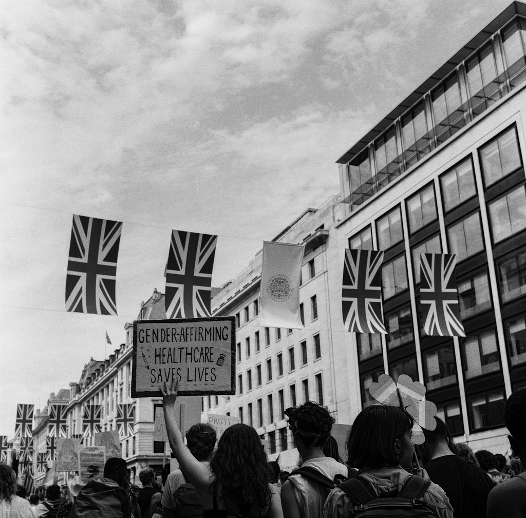
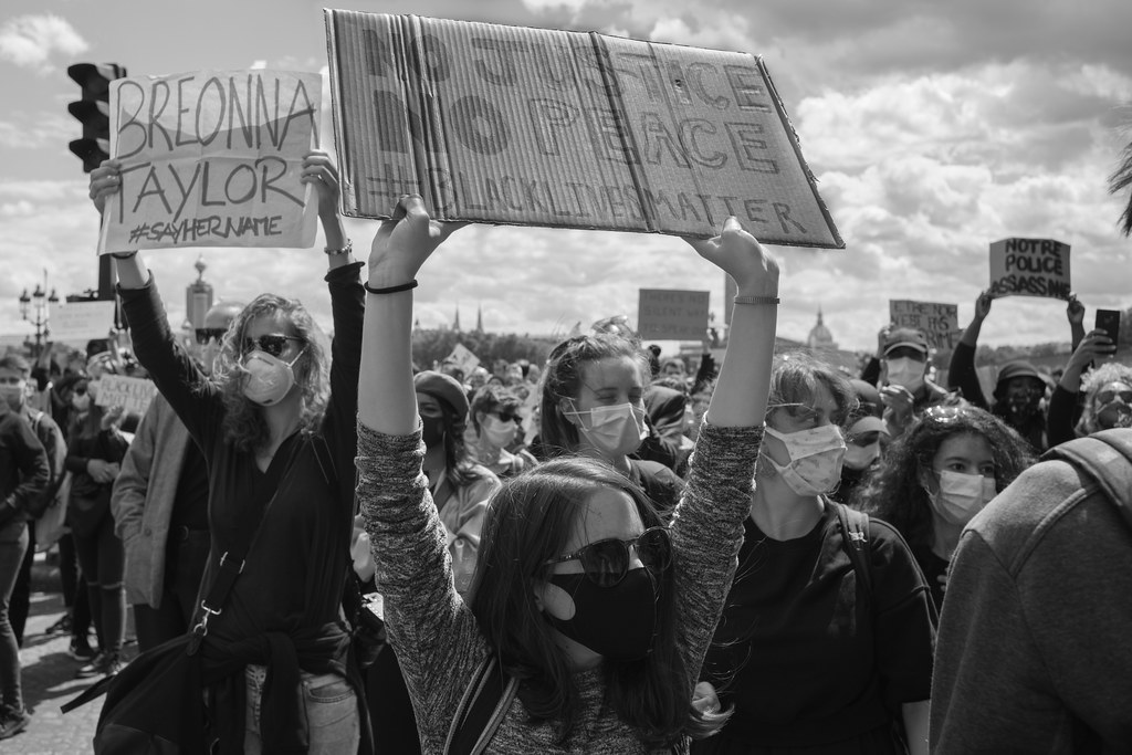
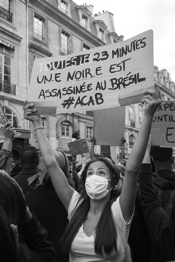
Of course, it wasn’t just Jo and their family being affected by this – hundreds of thousands, if not millions, of people across the country struggled with the “AI bureaucracy” that became more and more entrenched. By 2048, there was widespread discontent with “AI” and its automated oppression – leading to thousands of people at protests across the country – calling for another “AI” winter, to safe both society and the environment. Beyond those protests, it also led to direct action in a renewed “AI from Below” movement. A movement that Jo and their friends joined early on and were quite instrumental in. They started by investigating how and why these systems fail, beyond the obvious political will for deploying them. Instead of taking a “technology first”-stance, they took a “people & problem”-first viewpoint.
Looking at the existing “AI” solutions, they quickly re-discovered that one of the big reasons for why these approaches failed was the underlying assumption that predicting towards an “average” or “most likely” outcome would automatically also mean for it to be correct or even good. Because, for all the advanced technology and mathematics, that’s what those systems did at the end. Of course, even early 21st century Sci-Fi authors, such as Ted Chiang had warned about this. Already in 2023, Chiang wrote about how “AI” is “a blurry JPEG of the Web”, referring to how these systems tend to only regurgitate existing data into average representations, creating “blurry” outcomes. He used this to refer to “ChatGPT” – which kids today can read about in the history-section of NeoWikipedia – but this of course applies to all “AI” tools. And, as it turns out, none of us is really “average”. That’s why back when we had cars, you could move the seats in them back and forth to fit for your height.
They also found how “AI” not only generates “average” outcomes, but also can only produce these averages based on historic data – with all the biases, discriminations and other issues that are within the data. So what if, for example, police tended to over-police marginalised communities? Or if checks for social security fraud particularly targeted certain demographics, such as “deprived neighbourhoods” or those with disabilities – like Jo experienced first-hand? In those cases, “AI” was particularly likely to negatively decide over these communities. And even worse, all attempts to address those overtly prejudiced systems just pushed them to only become covertly prejudiced instead, by trying to pick up on secondary signs in the data, such as the way people write and talk!
Jo and their friends thus set out to do their own data science research and create both the data and the “AI” deployments that would be useful to them – making use of their embodied, lived understanding of these existing limitations. Given that nothing about us without us had been a rallying cry for the disability rights movement and other marginalised groups for decades, it was no surprise that the “AI from below” movement started there in the early 2050s.
Collectively, they took inspiration from some of the examples of movement-driven data collections for advocacy and citizen-driven science that happened back in the early 21st century:
By their nature, these efforts that Jo and the AI from Below movement put together throughout the 2050s typically remained small and localised, and generally people looked at them in a somewhat bemused way. But slowly, this practice became more accepted: After years of “using ‘AI’ to deploy interventions at scale”, these large interventions became less and less common, as people recognised the benefits of small-scale, localised and community-driven “AI” approaches. Ultimately, even the government agreed, and finally stopped all the “one-size-fits-all ‘AI’ deployments” in 2069.
Of course: These changes were also helped by the world slowly running of resources such as water and electricity, which made such large efforts harder and harder. Thanks, climate change! But that’s not to lessen the credit to Jo and their fellow grassroots researchers. Due to their efforts that we understood how local, situated knowledge could be paired with tailor-made “AI” solutions that were created by – and in service of – these communities.
Back in 2074 this is a particularly old idea – going back over a hundred years: For science and technology to promote humanisation, it requires people to be active participants in it. And not just be mere objects of scientific interest. Thanks to the efforts of Jo – and their countless community collaborators – we are now more on that path than ever before. And with that, let us congratulate and celebrate Jo once again! Have a lovely birthday celebration! And now it’s time to sing and cut the cake!
Added 2024-05-15 23:00: In the Q&A at the event, the question for potential readings (beyond the sources linked above) came up. My recommended readings included:
]]>


 click to show full size
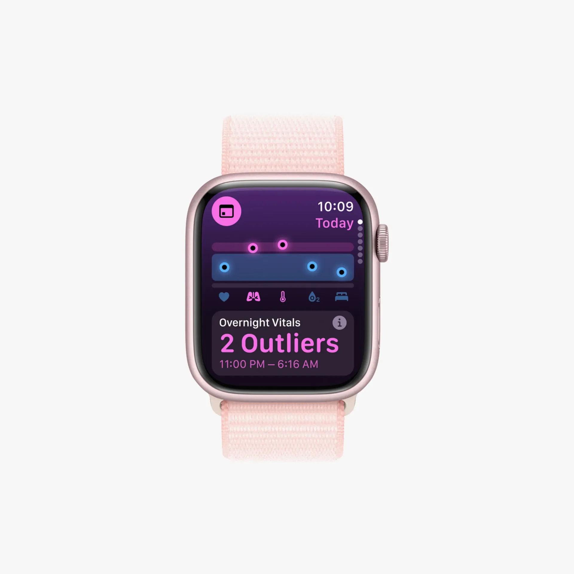
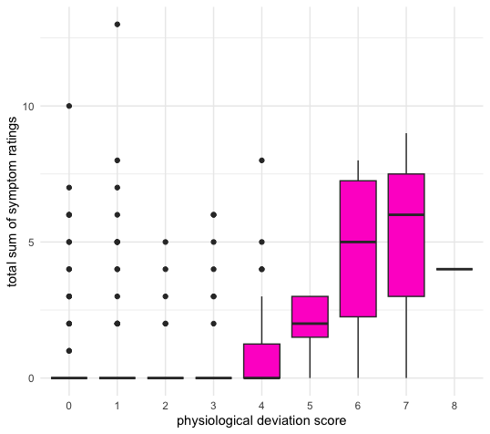
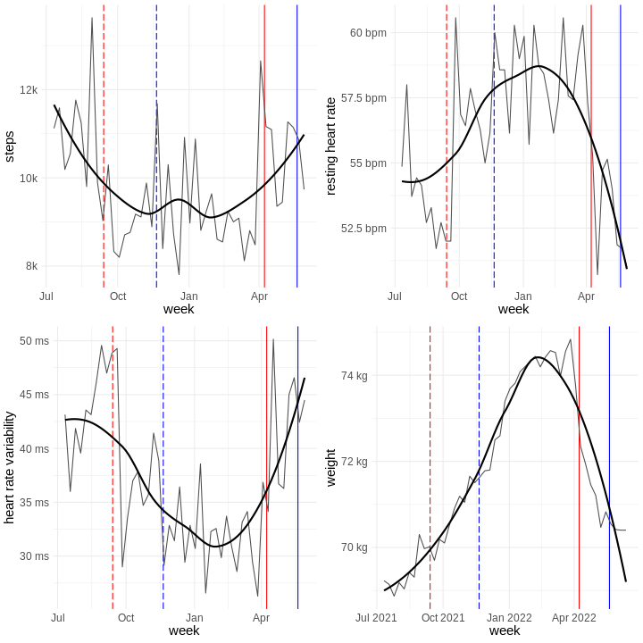
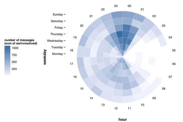
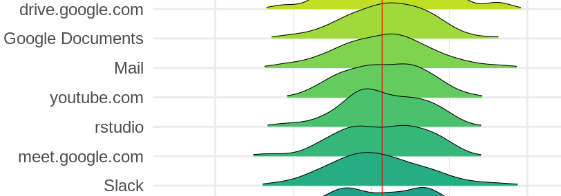
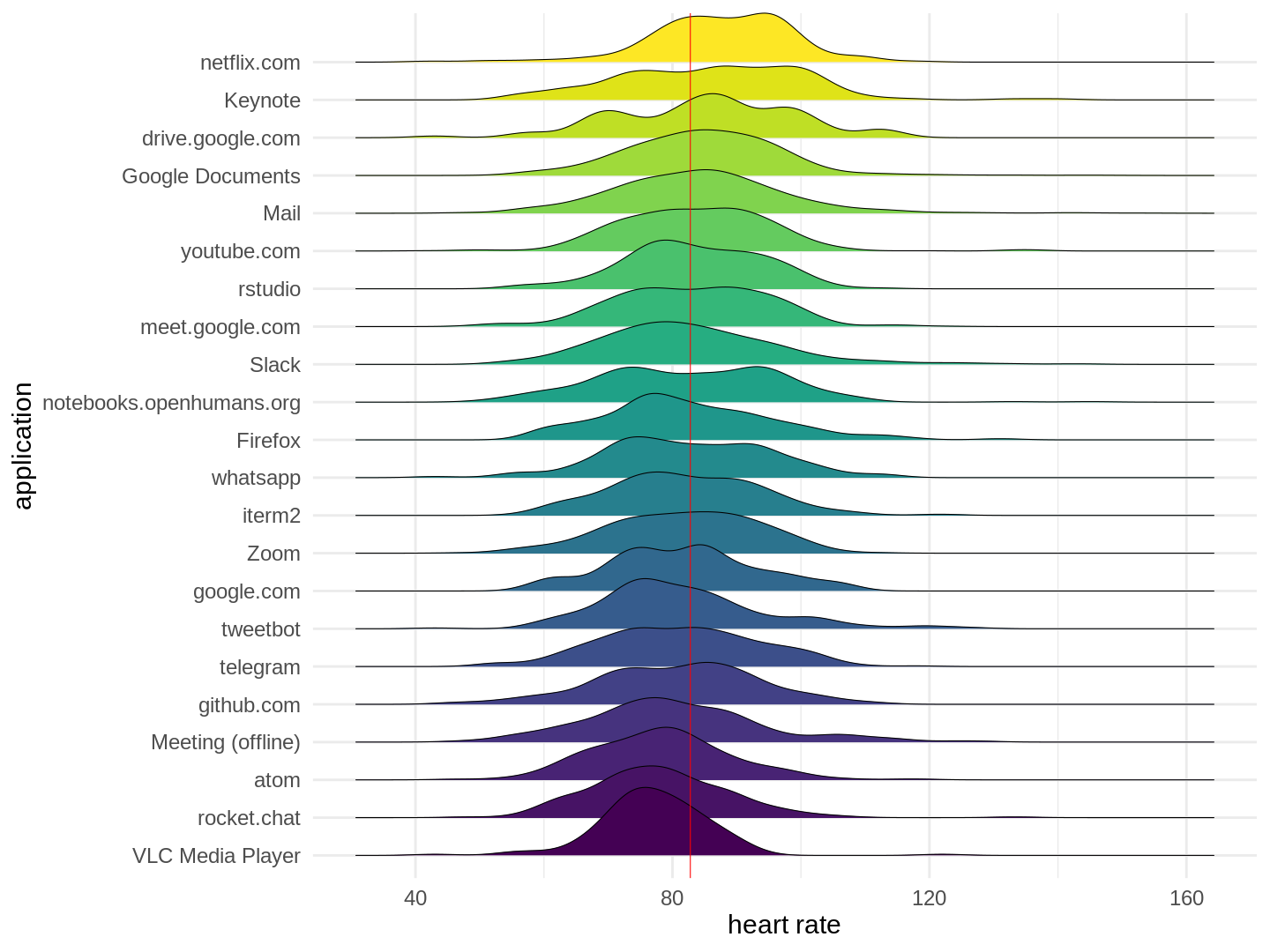
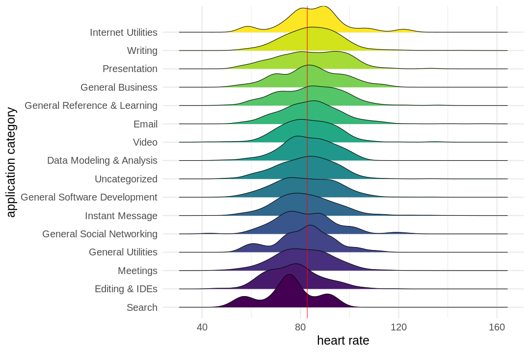
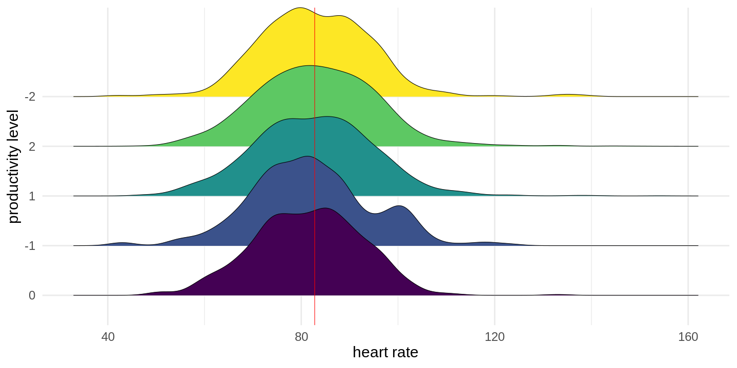
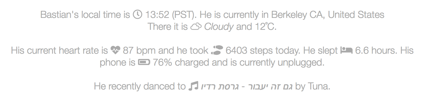
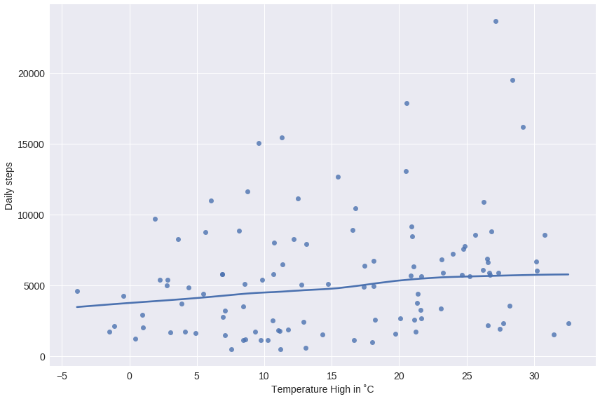
 I started wearing my first Fitbit in early 2012, tracking my daily sleep and movement as well as my weight. Since then I moved over to an Apple Watch for tracking, but the idea remains the same. In between I wore other trackers as well and
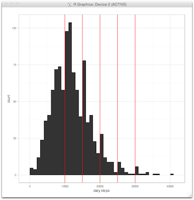


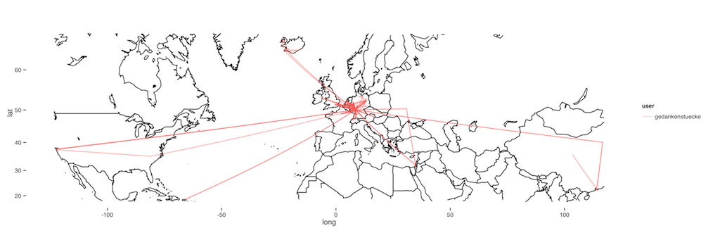
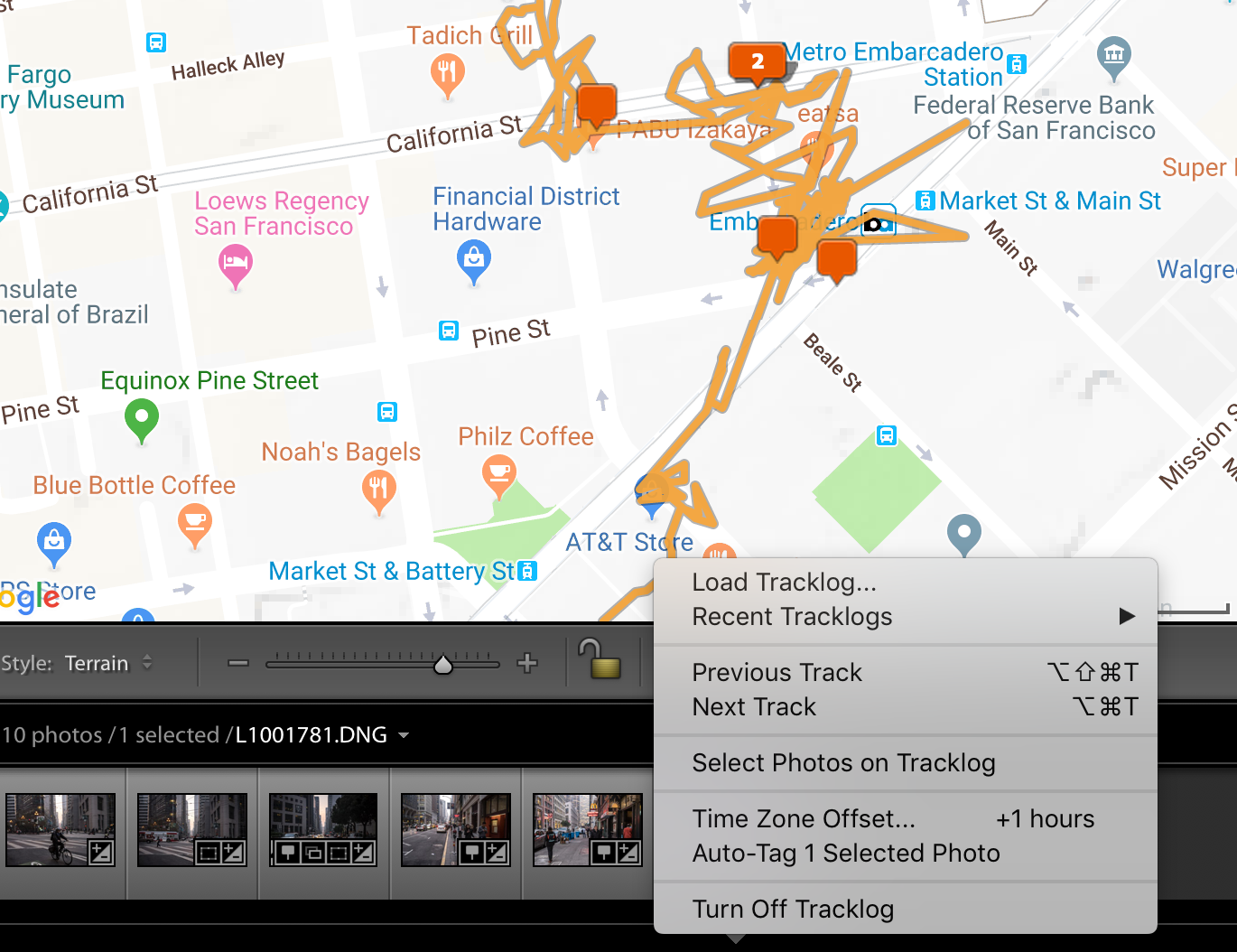
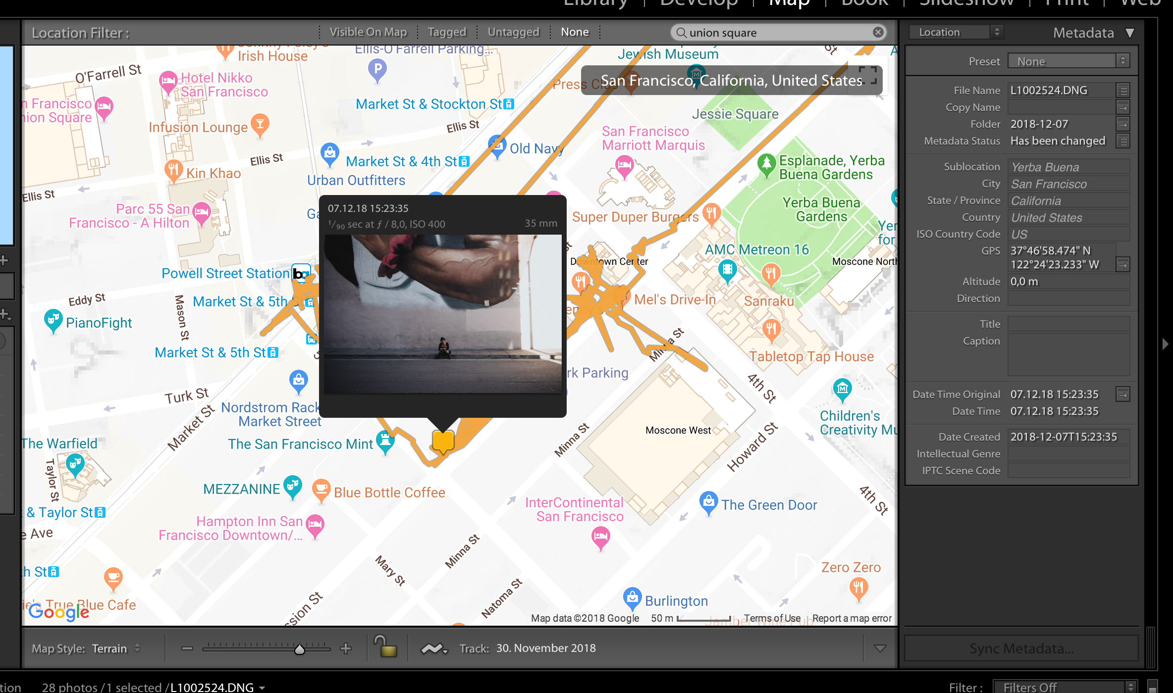 Geotagging photos in Adobe Lightroom.
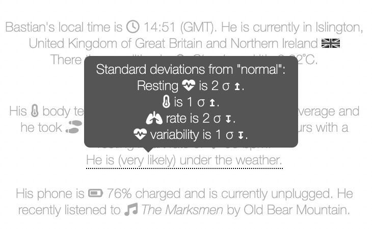
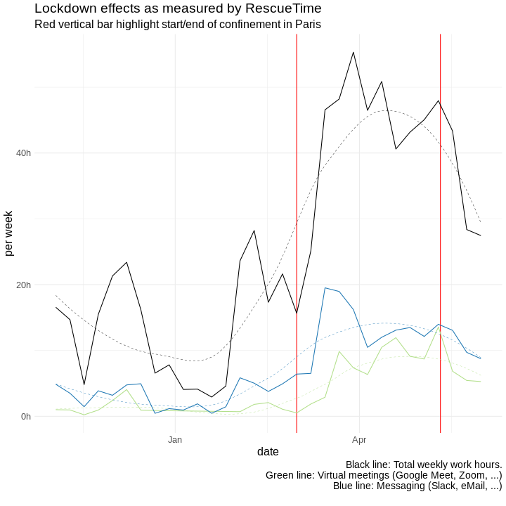
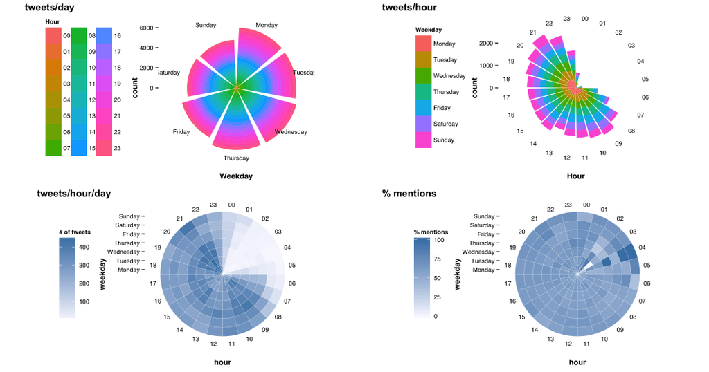
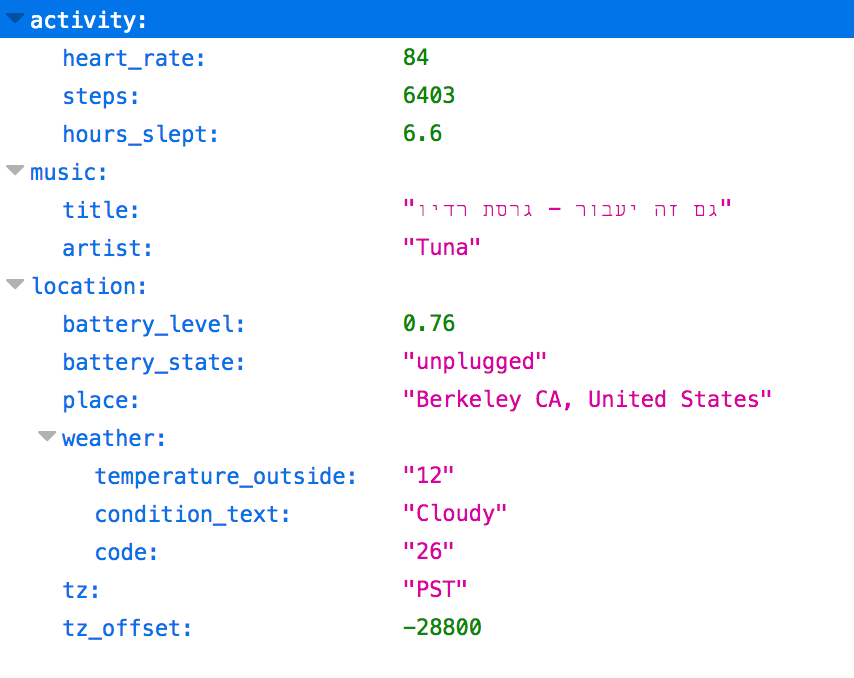
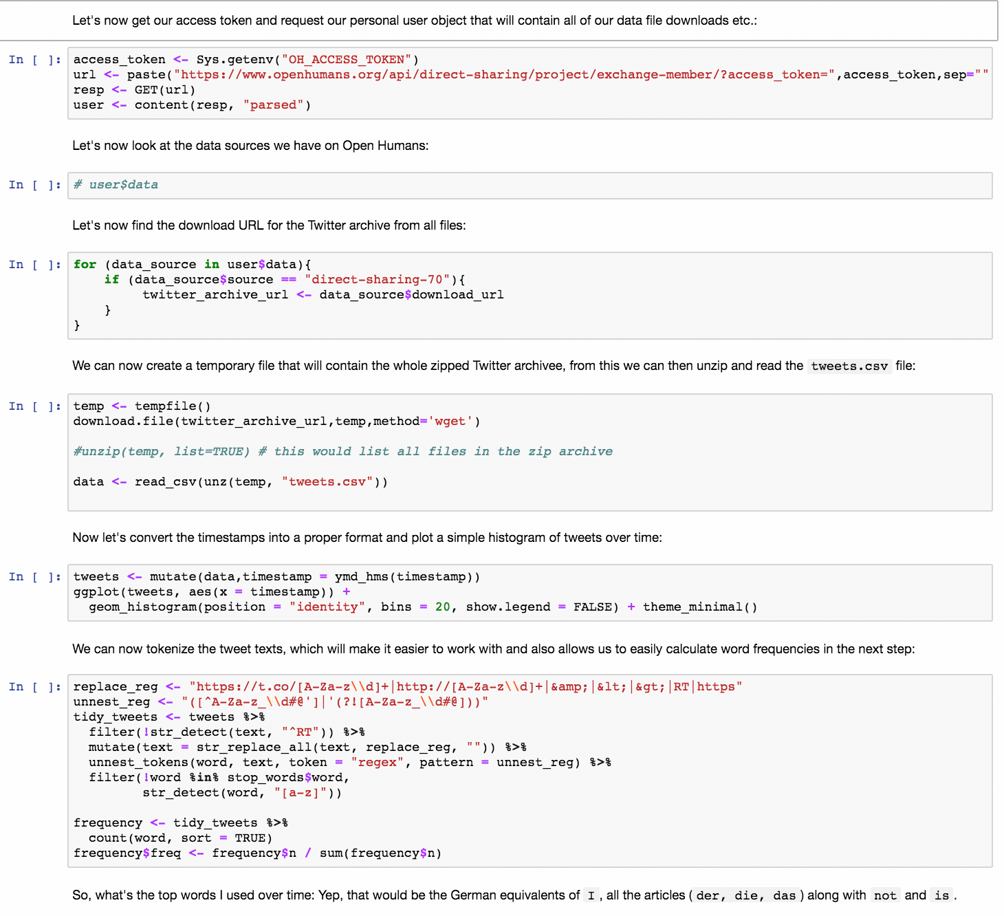
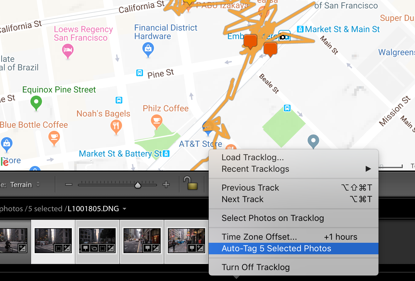
 What the output of a personal API can look like.
