#ScienceIsGlobal
Last week the The Royal Society issued a joint statement about the importance of the international nature of research along with national academies across the UK and Europe. At the same time they started the hashtag #ScienceIsGlobal on Twitter, where individuals reported what nationalities are collaborating in their labs.
For openSNP (I bet I forgot some country!): 🇨🇦🇧🇷🇦🇺🇩🇪🇺🇸🇮🇳🇬🇧 #ScienceIsGlobal
— Bastian Greshake (@gedankenstuecke) July 27, 2016
I, and many others, reported their lab’s composition using the emoji flags. I assumed those should be easy to parse those flags out of the Twitter stream, to create a network showing the international collaborations that happend across the globe with people from so many different countries. Because I was too lazy for anything else I set up the Twitter Archiver, which stores all the data it collects in a Google Docs spreadsheet. Which gave me around 9000 tweets at the time, all publicly stored here. And as the parsing goes on the data set will automatically grow over time.
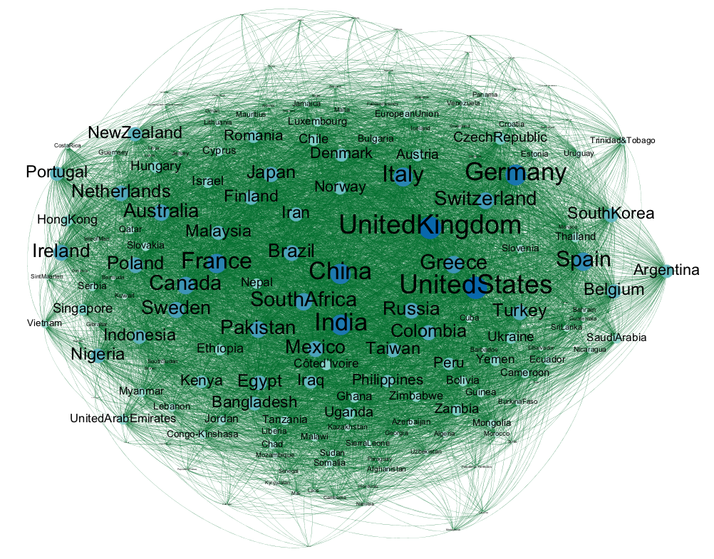
Using some rather ugly Python code (to be found here, along with the resulting output), I extracted the emoji-flags from those tweets as a simple adjacency list, to import them into Gephi. Only to figure out that UTF-8 is terrible and that there’s apparently no way to make Gephi display the flags. If I’m wrong on that please let me know how to make that work, as I spent like half a day of my life fighting this battle. So instead I ultimately gave up and converted the more interesting flags to (boring!) text instead, which could then be somehow displayed on a network.
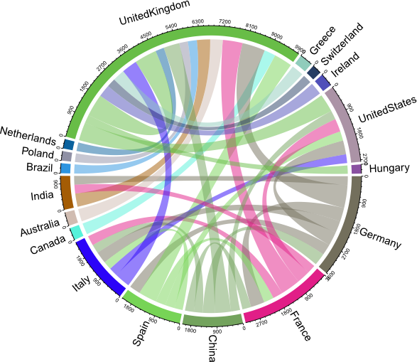
The tl;dr of the resulting graph: Science is truly global, as all you see is this ball of wool, for many countries there are edges leading to all other countries in the graph. Though there is some heavy focus on the usual (mostly western, rich industrialized) suspects. You can see this even more when creating a chord diagram, as suggested on Twitter. Without any filtering the graph would be just as messy as the network above. But by filtering the list down, only including connections spanned by at least 300 researchers, we can see the focus much better.
If you want to explore the data yourself, maybe even coming in with more network knowledge than I have, please play around with the data!
UPDATE 2016-11-15
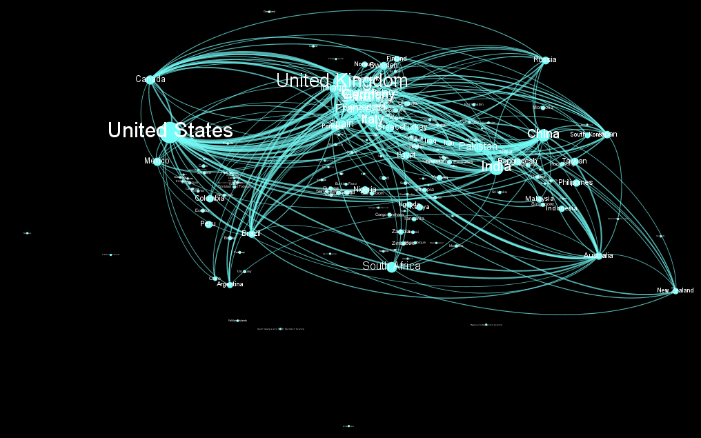
Bianca Kramer used the data to create much more beautiful graphs using Gephi. She added the latitude/longitude information to the nodes and with that projected the network on a map. The graph above shows all connections between countries that appear > 100 times. You can find her CC-BY-4.0 released work with more details on GitHub as well.